Hello! This is just a small meme I'm planning on doing on my blog every Saturday! It is where I find books from different countries or compare paper back to hard back and judge who is best dressed. Hope you enjoy! Also, keep in mind that I find these covers through goodreads so I apologize if they're incorrect.
Greece Edition Denmark Edition
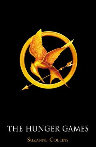
United Kingdom Edition Germany Edition
Since I live in the United States, I decided to leave that one out. (also ignore my really bad blogging skills). I love the background on the Greece Edition. I think the texture looks amazing; however, I feel like the title kind of takes away from the cover itself. I think the Denmark Edition is interesting. It's a super scary cover for some reason to me. Maybe it's because of the girls expression. I don't like how the symbol is really tiny and hard to see. I also am not a fan of the blue tint to the whole cover. I love the simplicity of the United Kingdom Edition. I really like how the symbol stands out because it's a huge thing in the whole trilogy. I just don't like how Suzanne Collins's name is so tiny. I love all of the colors in the Germany Edition. I love how her green eye goes with the leaves and how the leaves have blood on them. However, every time I see this, all I can think is the Uglies series by Scott Westerfeld. I also wish the symbol of the mockingjay was a key point on the cover.
If I were in a bookstore, I think I would pick up the Germany Edition first because the colors really stand out, but I doubt I would pick up the book because of the plot (Im not a huge fan of THG). If I seen the UK edition, I might think about keeping the book just so I could have the cover on my shelf. So the winner is...for me, I'm going to have to go with the United Kingdom Edition. I just love the simpleness but yet it's still very powerful. I love how the colors seem really neutral then BAM yellow and gold.
So how about you? What cover do you think is the most best dressed?


For some reason I'm never a fan for covers with people's face on it. It is rare that I come across one that does it well, Splintered is a good one by the way. I would much prefer something simple and elegant with very interesting styled fonts, so I actually like the UK one very much. The Denmark cover is really a weird combination... even the color scheme makes it as if Hunger Game is a horror story instead of a dystopia.
ReplyDeleteAngel @ <a href="http://sparereads.com>Spare Reads</a>
I agree. I've never read Splintered but I do really love the covers. I hope to read them some day and I agree about the Denmark cover as well. It does seem to give a different theme to the whole trilogy!
Delete-Amber